Color plays a very important role in the marketing of your products. It can be an advertisement or the product itself or even the company logo. The right color gives you an advantage in promoting & branding your company. Color shows the true characteristics of your brand. Repeating a particular color is a marketing strategy used for brands based on the knowledge that humans tend to connect with the brand color more easily than any other aspect of the brand.
Color psychology is the way in which humans behave toward a particular color. This form of psychology is commonly used in advertising & marketing of your brand to get a positive response from your targeted consumers. As per color psychology, colors vary in emotions & behavior. Research has shown that people tend to connect with brands more easily based on the highlighted color scheme used. Knowing your market is very important while choosing the color scheme. The choice of the right color scheme gives the brand its recognition and respect. It is also important to use colors related to the product for better brand success.
Shades of Blue:
From all the available primary, secondary colors & even hues, blue is the most sought-after shade in marketing. It is the most favored & versatile color in brand imaging. The hues of the blue shade are meant to denote a variety of feelings. Light blue is often called as a creative color, sky blue as a calm shade meant to relax & also inspire, while dark blue relates to intelligence & lack of emotion.
The Color Psychology of Blue:
How does one feel while looking at the blue color? Some say that colors relate to different moods & feelings. Researchers proclaim that colors do have a psychological effect on you.
Freely found in the daytime sky or in a deep pool of water, blue color merges in nature very easily. That is why many relate to the color blue in a peaceful sense. But it has a negative side too where the darker tones of the blue color can also sometimes relate to being cold & distant.
Some highlights of Blue:
Blue is the most favored & preferred color by many people, especially men. It is often termed as a gracious color other than being conventional since it is favored by many. Blue tends to keep your mind calm & is often the color of choice to describe peace. In advertising & marketing, the color blue is regularly used as it projects security & instils a sign of reliability. Researchers have analyzed that employees tend to be more productive in blue rooms, hence, many companies decorate their offices in the shade of blue.
Even though a popular color, blue is supposed to be the least appetizing. Blue plates are sometimes recommended in weight loss programs to dissuade an obese eater. Blue color does not appear naturally in fruits, unlike some other colors except for blueberries & some plums. This color can also react adversely and make a person feel sad & lonely if heavily promoted.
Blue Color Psychology in Marketing:
As a marketing company, everyone wants to convince the consumer that their brand is the most dependable product available. For that purpose, the right color has to be used at appropriate places on the brand to attract the consumer. This is the psychology of color used very distinctly as a marketing strategy.
The color blue is a very common feature in your daily life, setting in a range of emotions like:
· The blue sky indicates that spring is coming around bringing with it warm temperatures.
· Colorful balloons afloat in the blue sky in celebration.
· Commonly used color by most political parties.
· The blue ocean you dream of taking a dip in.
· More than 50% of national flags contain the color blue.
· Blue jeans are what you think of when you imagine denim, which is favored all over the world.
There are many more instances where the color blue, unlike other colors, relates to your life on a daily basis. Therefore, it is the most commonly used feature while marketing a brand.
In marketing, blue is the most sought-after color & appears in at least 33% of top brands. To understand the color blue, you must know more about its different shades. Each shade has different meanings & emotions varying from corporate blue to baby blue.
· Visitors feel welcomed & are at comfort when blue color is used on your website.
· Any normal or serious content of a page can become a visual delight when presented on a dark blue background.
· A brilliant blue color will also help any brand name stand out from the rest of the content if used on a light-colored background.
The color blue is invariably used in plenty for designing logos & branding products, varying with the industry. As it relates more to being trustworthy & reliable, it helps in nurturing client loyalty. This feeling the color provides has made many financial institutions & banks to use it in their brands, including well-known banks like Bank of America and Chase.
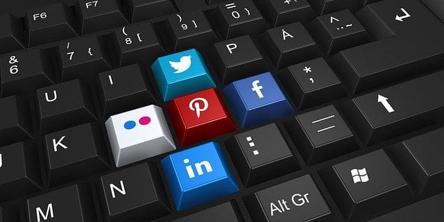
Even several successful corporate business empires associated with innovations use its shades in logos & branding due to its non-interfering & fruitful appearance. This calming color appears in logos & brands of some top US companies. Companies like Microsoft, Twitter, & Facebook, make use of this color in their brand logo.
Blue is frequently linked to trust too. Automobile company Honda uses the color in its branding in encasing trust & reliability to customers in warranting a trouble-free run of their vehicles for 20,000 miles or more. Many companies use the blue logo to instill a character of being trustworthy & dependable. Blue is also widely used in branding medical & even dental products as it could help in calming a nervous patient.
The blue color is widely used in logos or brands of many business houses serving the software, finance, pharmaceutical, bank & even the government sector. The article ‘Meaning & Uses of Colors in Logo Design’ emphasizes that the blue color in a logo or a brand indicates authority, power & trust.
Almost all financial institutions use blue in their logo. In another article ’Top Ten Financial and Bank Logos’ it mentions that eight of the ten banks have their logos in blue, which helps them in gaining the customer’s trust. Most of the data conceived during that period show that their blue logos work.
Even retailers use blue in their logos. Walmart, a supermarket where you can buy groceries & do shopping too, uses blue in their logo. For them, the use of blue positions them as a trustworthy brand. Whereas, a retailer like Oral B, which sells toothbrushes & other healthcare products, uses blue in their branding to impress on quality & reliability.
To sum up on Blue color Psychology:
The relaxing trend of the blue color has made Pantone create & release ‘Natural Optimism’, a color that expects people to feel good when looking at it. As per a few surveys conducted a few years back, blue is America’s favorite color. In fact, the survey showed that men & women preferred blue color more than any other color.
Blue has always been seen as a very positive color representing trust & reliability. The secure & calm feel of the color is the reason many organizations use it for their logos & branding. Blue color psychology surely has a role to play in our day to day lives.